
Ron Earp
Admin
The GT40 Version 1.0 Style is now in effect on the forum!
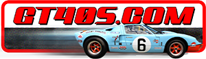
You should be looking at a Gulf colored scheme on the forum with a Gulf GT40 image from our very own Al Hirsbrunner in the upper right corner (guess what number car that is/was originally, we'll give you a prize!!!!).
I've tried to lay out the menu items in a logical way for you. The most used items, Forum, User CP, Register, Login/Logout, Search, and Quick Links are on the top menu bar. Quick Links will take you everywhere, New Posts, User CP, etc. so it is easily "grabbed" in the upper right on the top menu bar.
The menu items that are not used as much are on the bottom menu - Support Forum (Donate), GT40s.com Store (coming this month), Member Rides, Chat (new one coming), Gallery, Member List, Calendar, FAQ, and last is New Posts. I know New Posts is used a lot so I put it out to the side on the bottom menu so you can easily get to it, same as Quick Links on the top menu bar.
The icons and buttons on the forum are subtly different and I feel look better. Also, there have been fixes made to the profiles shown on the forum on the right hand side of the screen with threads. The reputation, online icon, and others now stay up with the person's name instead of dropping to the bottom of that box the way it did.
This is the first change in a list of many that will be happening over the coming weeks and I hope you like it. Remember, once all of this is loaded and cached on your computer this skin/look will be just as fast as the old one. But, for those that have to have the old one in a few weeks it'll be installed as a low-res version for dial up users and will be spartan.
We'll be tweaking this look over the next few days in order to improve it because I know it isn't perfect, but it is a new start.