Coronavirus - Excellent Data-Based Analysis

Recently there has been criticism of too many ‘armchair epidemiologists’ creating confusion with misleading predictions. So apologies for this, but think there are some interesting nuances although I accept that projecting from existing data is always risky.

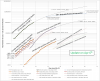
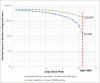
There has been so much discussion about the amount of testing and the spread of the virus, I thought that combining the testing data with predictive models based on the mortality rate data could provide some further insights. In addition, both the USA ( https://covid19.healthdata.org/projections ) and Province of Ontario (where I live) have recently released modeling predictions of cases and death tolls projected to April 15th and 30th.

In the attached plot I have combined the Worldometer data from USA and Canada. The top 2 curves show the daily reporting of the number of cases in the US and the estimated spread of the virus based on the mortality count with my assumptions of a delay of 17 days and a mortality rate of 1%. The US projection of deaths assuming best case scenario from the healthdata.org site is shown by the dashed line on the top curve. The projection from the mortality rate derived curve seems to be in close agreement with the healthdata model output up until April 15th - you have to count back 17 days on the mortality based plot – to March 29th to account for my assumed delay between infection and death. It seems an aggressive target but let’s hope they’re right.

The Canadian data is presented in the bottom half of the graph. Up until now the Canadian government has not released any modeling results only Ontario.

The straight line end-points from their model projection are shown for no intervention and assumed effects due to current levels of intervention.

In both plots you can see the reducing LOG slope of the mortality-based and testing results curves with time. I’m not sure it’s all due to intervention measures as the flattening visually begins some days before March 20th when widespread measures were first introduced.

I varied the mortality rate of the Canadian curves to get an idea of the sensitivity. It doesn’t have an effect on the shape of the curve only the x-offset.

A final observation, it may be possible to evaluate the level of testing relative to the spread by comparing the shape of the test curve to the mortality-based curve. This would indicate significant under-test in the US during the early days of the outbreak (as is widely reported) which has apparently improved recently as reflected by the better tracking of the curve shape. The high rate of positive test results in the US (currently about 22%) would be a concern. Canadian rates have remained relatively low (about 3%)

The WHO recommends that the rate of test positives should be kept below 10 – 12% in order to track the spread effectively.

I am sure the GT40 forum is not the best place to put up such an analysis but assume that you wouldn’t click on this thread unless you were interested in the virus discussions, and I know there are quite a few analytical guys on this forum. You can remove this post if you don't think it's appropriate
 

Attachments

  • covid analysis apr-06.png
    covid analysis apr-06.png
    273.1 KB · Views: 214
The problem with that model is it is a best case scenario where intervention measures have been almost 100% effective. I sure hope they are right.
 
Based on the projections from my model, if the HME predictions as of today are correct; i.e. 52k deaths by Apr 30th, that would suggest about 60,000 lives will have been saved since intervention measures have been in place. Although still a horrible total, it would also be a remarkable saving of lives.
 
I've attached an update to the model predictions I've been working on. I hope I'm wrong but the results imply that the measures taken to flatten the curve might not be working as well as the HME projections (as of today) may be assuming: https://covid19.healthdata.org/united-states-of-america.

I am only working on national level data so doesn't include any of the more detailed modelling that I assume HME are using. Hopefully, there are some subtleties I'm missing. I explained my approach in the post above; it uses the Worldometer data from death statistics to estimate the extent of infection in the USA projected back in time 17 days. I can provide the article I used as the basis for this reasoning if anyone is interested.

I then plotted that with the covid virus testing data (Worldometer Total Cases). The 2 curves when viewed together this way seem to suggest that a large percentage of the infection is undetected; (asymptomatic, mild and not tested due to lack of test kits, etc). It is likely that once a level of illness severity is reached, a test would be performed.

When you first look at the graph, you would probably think that a projection from 17 days ago can change a lot considering so much is going on. However if you assume that the testing is now roughly tracking the spread of the virus, especially over the last few days as testing has ramped up significantly, then the shape/slope of the testing curve can give some guidance as to the future shape/slope of the infection (top) curve.

The testing curve is a more recent reflection of the spread of the infection. If you assume about 5-6 days from infection until serious symptoms show up, and a 1-2 day delay for getting test results back, then the curve would give an idea of the spread rate of the virus from about 8 days ago; i.e projecting the next 9 days of the top curve. I transposed the last 8 data points onto the top curve and found that they fell exactly onto the projection line for the top curve. This may all sound like a bit of a bodge, and it probably will turn out that way, but all the recent outbreaks (outside of NY/NJ) are a worry that the curve isn't flattening as much as hoped.

Based on this approach, the model predicts about 100k deaths by the end of April compared to the HME projection of about 52k. I will be watching the progression of the testing over the next few days and hope that a marked flattening starts to appear.
 

Attachments

  • Covid analysis - Apr 9.png
    Covid analysis - Apr 9.png
    137.5 KB · Views: 198
Well some good news I think. I have updated the model with the latest data, and it looks like all the pain of the intervention measures have paid off big time. Although slightly higher than the current IHME model predictions, the curve has been bent significantly. It looks like the death toll will be limited to around 80k by the end of the month. I know it must seem perverse to say that's good news, but intervention measures will have saved over 100,000 lives by the end of April. The IHME updated model should be released soon so will be interested to see how it compares.
Looks like everyone's sacrifice has been worth it. However, measures absolutely must not be relaxed for the moment as there are still more than 5 million infected carriers out there.
 

Attachments

  • combining mortality and testing data prediction.png
    combining mortality and testing data prediction.png
    153.5 KB · Views: 227
In one month we've seen an increase of over 500,000 cases and 20,000 deaths.
Is it possible to go back to Feb. 15th for example and create a graph that would show the results of full mitigation if we had started then?
 

Randy V

Moderator-Admin
Staff member
Admin
Lifetime Supporter
There’s been a large number of recent deaths from pneumonia that have been reattributed to COVID-19 from what I understand. Apparently if someone dies of pneumonia and was not tested for Covid-19 and later on someone in that household tests positive - the cause of death is reassigned... Not sure I agree with that...
What I would really like to see is a comparison of deaths due to Influenza vs. Covid-19...
 
Hi Allan, It really difficult to work that out from my crude model. But I am developing a huge respect for the modelling done by HME: https://covid19.healthdata.org/united-states-of-america
Each day I add new data to my model, it gets closer to their predictions. Since the release of their first model was on Apr 2, it has changed very little in terms of predictions (slightly downwards) in the updates from Apr 5 & 11. They use very detailed physical models with each measure type; school closures, business closures, etc and when the measures were applied for each state. They say the results assume all measures remain in place until the end of May.
I am sure they could say with some certainty what the effect would have been if they had been applied differently. I would certainly listen to them regarding how and when to re-open things. I know for sure we were on the very edge of it exploding by an order of magnitude.
 

Doug Dyar

Supporter
There won't be a cure.
Thousands of viruses are rampant on this planet. Herd immunity is Nature's answer.
What happened to all the other causes of death? No heart attacks? Really?
We're being played, gentlemen. Plain and simple. Follow the money...
 
Model update: the bending of the curve continues as you can see in the top curve, and the projection is continuing to approach the IHME model results.
Some more good news; the number of new cases per day has been dropping for the last 2 days, the first time this has happened since the beginning of the outbreak
 

Attachments

  • model update Apr 13.png
    model update Apr 13.png
    186.5 KB · Views: 217
One of the key issues coming up is when to open things up again. The risk if its done too soon will be a rapid re-establishment of the spread followed immediately by new exponential growth.

The problem is that with the very high rates of spread over the last week, there are a lot of fresh infections out there.

The most recent analysis suggests that on average, there is a 21 day period between when a person first gets infected and when they are no longer shedding the virus. This includes a period of 8 days after they have recovered to the point of being virus free. If we take that as a basis, it is possible to estimate the extent of the infection that will be present at the end of April.

It would appear the the peak in new cases may have occurred about Apr 10th. Over the last 2 days the number of new cases has dropped by about 3000/day. I have modelled 2 situations, both based on the assumed peak having been reached on the 10th. The first assumes an ideal example when new cases magically drop to zero the day after the peak and stay at zero for the rest of the month. The 2nd (green line) assumes an optimistic linear daily reduction in new cases by 3000 per day. In reality there will be a longer tapering off but this simple approximation gives some idea of the situation.

From the plot, you can see that the first case (blue line) reflects what you would expect, with infection rapidly dying out by the end of the April. However the more realistic (but still optimistic) case indicates how much infection would still be around at that time.

It is important to note that this analysis is based on detected cases data. It is known that the majority of infection has not been detected (asymptomatic/mild/not tested, etc). Initial estimates indicated 85-90% of cases remain undetected. My modelling shown above suggests over 90%. If I use the 90% figure this implies that about 1.6 million active infections would still be around be the end of April, or even higher depending on how new cases are tapering off.

Based on these results, it would be very risky to have a widespread opening of the country on May 1st. The benefits of waiting a further 2-3 weeks depending on the tapering of new cases is clear. I really hope they take this into account when the administration makes its decision.
 

Attachments

  • Estimated Infection April 30th.png
    Estimated Infection April 30th.png
    49.3 KB · Views: 253

Randy V

Moderator-Admin
Staff member
Admin
Lifetime Supporter
I posted this on Facebook and there's some pretty good conversation - I thought I would present it here as well::
Something just does NOT add up!
Population
...USA (2019) --- 330,149,796 1% = 3,301,498
China (2019) - 1,439,323,776 1% = 14,393,238
Look at the chart below that I downloaded today from WorldOMeters....
582,000 Cases of COVID-19 in the USA
..82,000 Cases of COVID-19 in China (where this whole thing started!)
----
Someone is full of beans!
China has 1.1 BILLION more people than the USA!!!
Check the link below for the rest of the stats...
https://www.worldometers.info/coronavirus/…

Worldometer_COVID-19_04-13-2020.jpg
 
Well I don't want to get into discussions regarding conspiracy theories, and I'm sure official figures are suspect, but just to restate what is on the Wikipedia site; the Chinese government imposed hard lock downs on 17 cities in Wubei province. The details are in the attachment. Most lock downs lasted for at least 2 months and were imposed on about 60 million people. The harshness of the lockdowns were imposed as only an authoritarian regime can do. I'm sure the numbers are 'optimistic' but think the effectiveness of isolation/quarantine/lockdown is beyond dispute.
To be honest, I don't really care if their figures are correct or not; it's not some kind of contest.

The only thing I care about is the timing of reopening. There's lots of partisan BS flying around at the moment and that helps no one. The most important thing is to try to navigate through all the noise and try to establish the 'facts' as best we can.
When and how the reopening is made will have an enormous impact of what follows. If we get it wrong the consequences could be devastating.
As a rough estimate, only about 2% of the American population is infected at the moment. This means that 98% is still vunerable!! If the opening is too soon and too widespread, the virus will roar back and restart with similar explosive growth.

In the midst of all this confusion, the modelling that IHME have done appears to be accurate and it's a gold standard resource that must be included in any decision making. I believe their 2nd and 3rd wave modelling for different types and timings of reopening should be made available to the public before any action is taken so that the extent of what's being asked in terms of human lives lost is understood by all. You don't made life-changing decisions that will affect us all without putting your best projections on the table.
 

Attachments

  • Wubei lockdowns.png
    Wubei lockdowns.png
    17.4 KB · Views: 197
The thing that really gets me is the comparison by many talking heads and radio hosts that this is just like the flu.My answer to that is this. How many health care workers died last year treating flu victims? When is the last time you went to the DR for the flu that he or she came out fully gowned gloved and masked to examine you?
I have a sister who is on the front lines in a big northeastern hospital. Its really taking a toll on them.They go to work scared and exhausted.Then go home and stay isolated from their families.Then get up and do it again..and again...and again.

This disease is one thing that didn't need to be politicized
but unfortunately it has been and our country is much the worse for it.
 

Neil

Supporter
"I am so angry I can not even speak...." ....and then continues to do so. ??????????

Can we keep politics out of this forum?
 
Back
Top