Ken Roberts
Supporter
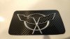
Looks great. Any interest in making center cap emblems to match? Will there be adhesive mounted to the emblem for a quick install? Definitely interested.
")


Those look pretty awesome Will.
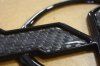
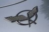
In the top picture the lighter part of the graphic looks silver, but the blue version on the bottom looks more white. Is the lighter printing in white ink?
I like the red one, but my only suggestion would be leaving the super in superlite white. The dark red lettering on black background causes it to get lost.
If you glance at it you only see the word 'lite' and the two legs/spikes.
Great work so far! Building a super car that comes with emblems is a big step up and a great finishing touch for builders of these beasts.


Anyone can use anything on their car, but please note that Mason's design isn't the official one - which is in progress.
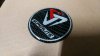
We've been trying to get them to be a reasonable price, and that is taking time. For those who want to wait for the official logos, here's a sample of what we are hoping to get done:
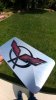
The blue badge is a prototype, but the production ones will be red as in the example above.
For those who feel they can't wait for the official version, copies of the emblem above can be obtained from Trevor at [email protected]. The official versions will be priced extremely attractively when they become available.
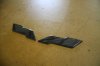
It's possible that there may be wheel cap covers that can be applied over the stock Forgestar wheel caps, but that is a future project.
Will who designed this masterpiece? The Isle of Man connection is brilliant! Testament to the SLC philosophy that less is more. Please find a way to produce the linear badge. I do agree the Superlite lettering in one color appears easier on the eye.
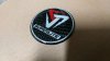
I sent Trevor a link to the thread and he had some spare time this afternoon and just enough epoxy to do an emblem to show how it'd look with a single color Superlite logo. If anyone happens to wants one now, welcome to email him directly or PM me if you'd like.